
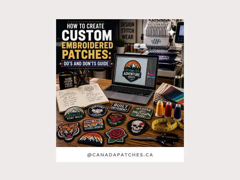
How to Create Custom Embroidered Patches: Do’s and Don’ts Guide
A well-made embroidered patch is no longer used just to decorate apparel. Now, it has several applications, such as representing a brand, team, or identity in a very visible way. But getting that clean, professional look is not always as simple as it seems.
In many cases, designs that look great on screen don’t translate well into stitching. Small issues like too much detail, incorrect sizing, or weak color contrast can completely change how the final patch turns out.
Problems do not pop up out of nowhere. The root cause mostly lies in design choices made in a rush during the early stages.
In this guide, we’ll go through the essential do’s and don’ts of custom embroidered patch design, along with practical tips to improve clarity, durability, and overall visual impact.
What Makes a Great Custom Embroidered Patch?
A great embroidered patch demands more than just a creative design. Unlike digital printing, embroidery works with thread, texture, and stitch limitations, which means every detail needs to be carefully planned. You have to understand that clean shapes, readable text, durable fabric, and strong color contrast all play a major role in how the final patch turns out.
The best embroidery designs usually keep things simple instead of overcrowding the artwork. Choosing quality thread and materials also helps the patch stay sharp, durable, and visually appealing even after regular use.
Dos of Creating Custom Embroidered Patches.
Creating custom embroidered patches Canada works best when the design is planned for real stitching. The focus should not just be on how it looks on a screen. Small decisions at this stage directly affect the final quality, clarity, and durability of the patch.
Keep the Design Simple and Clear
Simple designs usually work better in embroidery because they hold their shape and don’t lose clarity during stitching.
- Stick to clean shapes and minimal elements
- Avoid overcrowded artwork
- Focus on one clear visual idea
Use High-Contrast Colors
Good contrast helps your patch stand out and keeps details visible on different fabrics.
- Combine light and dark shades effectively
- Avoid similar or blended tones
- Test how colors look on actual fabric
Choose Bold, Readable Fonts
Good contrast helps your patch stand out and keeps details visible on different fabrics.
- Combine light and dark shades effectively
- Avoid similar or blended tones
- Test how colors look on actual fabric
DO Think About Size And Placement Early
Size affects how the patch looks once it’s applied to clothing or accessories.
- Match the patch size with the usage area
- Keep text readable from a distance
- Adjust design for caps, jackets, or bags
The Don’ts:
Don’t Overcomplicate The Design
Too much detail often gets lost once the design is stitched into fabric.
- Avoid fine lines and micro-details
- Don’t mix too many elements in one design
- Keep artwork visually clean and simple
Don’t Choose Thin or Delicate Fonts
Thin or decorative fonts often fail in embroidery because stitching cannot clearly preserve fine details. What looks elegant on screen usually becomes unclear or broken once translated into thread.
In real production, this can lead to:
- Broken or uneven letter shapes
- Reduced readability from a distance
- Letters merging due to tight spacing
For suppliers offering custom patches Canada no minimum order quantity, clarity always works better than style.
Don’t Ignore Size And Placement
Patch size is often underestimated until the final result is produced. When a design is reduced too much, important details lose structure and clarity.
Smaller sizes also limit how well the stitching can retain detail, affecting both readability and balance.
Common issues include:
- Text becoming hard to read
- Borders losing sharpness
- Icons turning unclear or distorted
In embroidery, size directly impacts quality; if it’s too small, even a good design won’t hold up well.
DON’T Skip Testing Or Sampling Before Production
You will be able to identify issues once the patch reaches the stitching phase. During the design stage, it is hard to detect the problems. That’s why skipping a sample is one of the most common mistakes in patch production.
Embroidery results can vary depending on thread, fabric, and stitch density, which is why testing is essential before placing bulk orders.
This can help avoid:
- Color differences from screen to fabric
- Uneven stitching in detailed areas
- Scaling issues in final production
A simple sample review often saves both cost and quality issues later.
Good vs Poor Embroidered Patch Design
This comparison is not just about style, it’s about how embroidery behaves in real life. Thread thickness, stitch density, and fabric interaction all influence how a design turns out once it’s manufactured.
| Element | Good Design | Poor Design |
| Complexity | Clean, minimal layout with clear shapes | Overcrowded with small details and effects |
| Colors | Limited palette with strong contrast | Too many similar or blended shades |
| Typography | Bold, readable fonts with spacing | Thin, decorative fonts that lose clarity |
| Size Planning | Designed according to placement (caps, jackets, uniforms) | The same design is used everywhere without adjustment |
| Stitch Quality | Even stitching with defined edges | Uneven fill, blurred edges, lost details |
| Durability | Maintains shape after repeated use | Frays or distorts over time |
Quick Practical Tips for Better Embroidered Patches
Small design choices can have a noticeable impact once the patch is actually stitched. It should look good on screen with no flaws, but it is more important how it behaves during the embroidery work.
Keep these points in mind before final production:
- Think about how the design will translate into stitches, not just its digital appearance
- Match fabric and backing with real usage, whether it’s light fashion wear or heavy-duty items
- Always ask for a stitch preview or sample before approving bulk production
These simple steps often prevent small design issues from turning into costly production problems and help ensure the final patch looks clean, balanced, and durable.
FAQs
1. What is the ideal size for custom embroidered patches?
The size depends on placement. Small areas like caps work best with 2–3 inch patches, while jackets or bags allow larger designs. The goal is to maintain clear readability.
2. Can detailed artwork be used in embroidered patches?
Yes, but it often needs simplification. Fine details and gradients don’t always translate well into stitching, so cleaner designs produce better results.
3. How long do embroidered patches last?
Durability depends on materials, thread quality, and stitching density. High-quality patches can last for years with proper use and care.
Let’s Conclude
You have to make smart design choices while creating effective custom embroidered patches to avoid complexity. When you understand stitching limits, material behavior, and sizing, the final result becomes much more predictable and professional.
Simple and well-planned designs consistently outperform detailed but poorly structured ones. Before production, always review how the design will translate into thread, not just how it looks on screen.
That final check is often what separates average patches from high-quality results.

I am the creative voice behind CanadaPatches.ca, turning complex patch designs and branding ideas into simple, easy-to-follow solutions. My blogs explain customization processes, material choices, and ordering tips in a practical way. I focus on helping businesses and individuals build strong brand identities. My goal is to make custom patch creation clear, confident, and stress-free.